
 Fun With Digital Photography
Fun With Digital Photography
Fun With Digital Photography
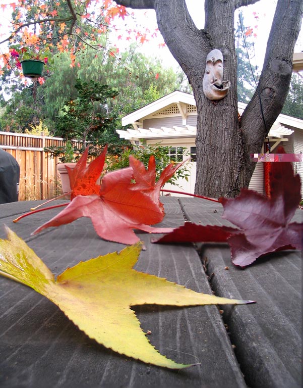
This first project was something I'd been wanting to try out for years:
to combine several pictures of the same scene, with different
focus ranges, to create a single picture with extended
depth of focus. This is common practice in ultrasound imaging.
Here the camera sat on a small garden table, with some
recently fallen leaves from a "Festival" Liquidambar
tree (so named because it produces leaves with a variety
of fall colors). About four yards behind the garden table
is a mask on the trunk of the tree, and about a dozen yards
further back sits a garage. Using Adobe Photoshop to extract
and combine the sharpest parts of six different images was
tedious, but the result demonstrates how well the technique
can work, and some of its pitfalls. One such pitfall is that
objects can end up with a halo around them from their
unfocused counterpart.
One day I would like to try automating this process. The
first part would be to have software determine automatically
what F-stop to use (based on the desired sharpness), and
how many pictures to take and to what distance each should
be focused (based on the F-stop and the desired uniformity
of sharpness). If you look closely at the leaves and the
grain of the wood in the garden table you'll see that the
near-field foci were spaced too far apart in this experiment
to get uniform
sharpness. Although this isn't easy to get right by
hand, it wouldn't be very difficult to write software to
compute the optimum settings.
Automating the combining of the pictures seems like the
hard part, but maybe the camera could help by using its
auto-focusing apparatus to record which parts of each
picture are in focus. A product called
Helicon Focus combines pictures without this information
and appears to do an excellent job.
I've used the technique of combining different
pictures of the same scene many times now, sometimes to extend
the range of focus
as here,
but it can also help in scenes
that combine very light and very dark regions that are both
rich in detail. For example, in
this photo,
the sky and the ground are from different exposures.
|
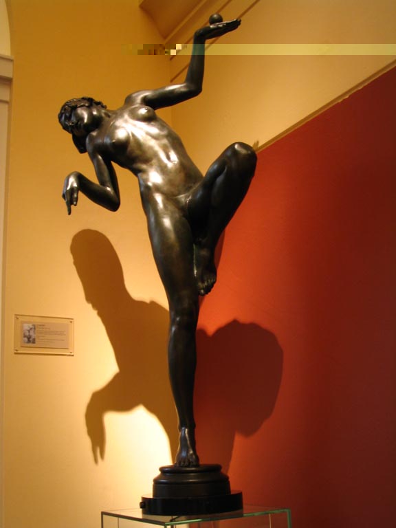
 This "Frog Princess" immediately caught my eye as I walked into the
Gilbert Bayes Sculpture Gallery
in the Victoria and Albert museum. When I noticed her shadow I
just had to try capturing this scene with my new digital camera.
Unfortunately, it was dim inside, the exposure needed multiple
seconds, and I did not have a tripod. I ended up taking
four exposures with the camera braced against a convenient
display case. They all came out blurry except for this one.
This "Frog Princess" immediately caught my eye as I walked into the
Gilbert Bayes Sculpture Gallery
in the Victoria and Albert museum. When I noticed her shadow I
just had to try capturing this scene with my new digital camera.
Unfortunately, it was dim inside, the exposure needed multiple
seconds, and I did not have a tripod. I ended up taking
four exposures with the camera braced against a convenient
display case. They all came out blurry except for this one.
As you can see in the first picture here, in spite of the
long exposure the princess herself came out too dark.
Unfortunately, lightening the whole image resulted in
washed out walls and a less interesting shadow. So this
needed a princess-shaped mask in Photoshop. Getting the
boundary between the lightened princess and the unlightened
walls to look natural was very tricky -- the mask had to
be just the right size and shape, and to have edges that
were feathered over just the right number of pixels. I'd be
embarrassed to admit how many hours I spent on this, and
how many false starts were abandoned as I learned Photoshop.
But I really came to love this work of art, and will no doubt
revisit the V&A museum the next time I'm in London.
I often wonder if her shadow was the artist's intent, or a
lucky accident discovered by a lighting designer at the museum.
|
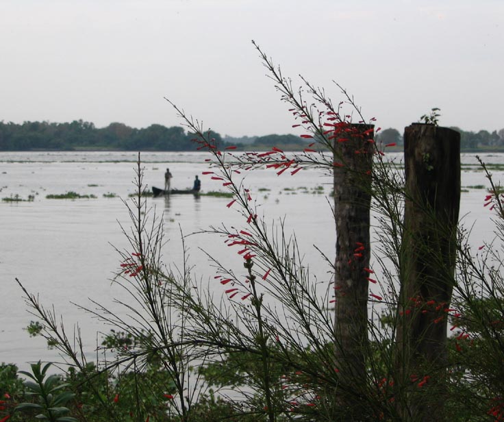
Here is an example of using Photoshop to rescue a bad exposure.
The foreground is too dark, the sky is featureless,
and the scene appears to be a bleak overcast day, when
really it was quite bright out.
A histogram of the image intensities in this picture shows
that it uses almost the full range of possible image
intensities, so the camera's auto-exposure feature probably
did about the best it could.

Notice though that the intensities are
bunched into three major humps.
The foreground of this picture is mostly
contained in the first hump.
The water and sky are contained
in the middle and rightmost humps.
Because each hump only uses a small range out
of the full range of image intensities, the image
elements corresponding to the humps lack detail.
Using Photoshop's "Levels" feature, you can
spread out a narrow range of intensities to make
hidden details more visible.
But first you have to separate the elements so you can apply
the Levels feature to each element separately.
Photoshop provides several ways to separate elements of an
image. Selection by color works great when, as in this case,
the things to be separated are different colors and/or intensities.
Once the elements are separated, you can spread out the intensity
levels in each element and then combine them back together.
This results in an image where each element gets as much
of the intensity range as it needs to look the way you want it to.
Because Photoshop allows you to adjust red, green, and
blue levels separately in an RGB image, you can also adjust
color at the same time.
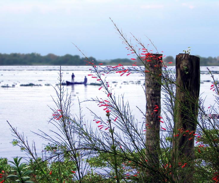 Although still not the best of images, the result
does look more like how the scene really looked when
I took the picture.
The "rescued" sky is blue and you can just
make out that there are faint clouds.
Detail that was hidden in the foreground is now visible
enough that you can tell the hyacinth floating in the
water is green rather than grey, and the flowers are
bright red.
Although still not the best of images, the result
does look more like how the scene really looked when
I took the picture.
The "rescued" sky is blue and you can just
make out that there are faint clouds.
Detail that was hidden in the foreground is now visible
enough that you can tell the hyacinth floating in the
water is green rather than grey, and the flowers are
bright red.
Once elements are separated, you can do more than adjust
the intensity levels. Here, the background has been blurred
to increase the perception of separation.
As with the Frog
Princess above, it is the boundaries between different portions
that are most difficult to get right. The more you alter each
element, the harder it is to combine them back together without
problems surfacing at their boundaries.
Correcting an image like this is a lot more work than getting
the exposure right in the first place!
|